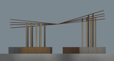
We began
construction today, but before I get to that I wanted to share a little bit
more about how we got to this point.
Last week, the
class presented 3 developed design schemes (shown above) to be considered for this summer’s
build project. Here are a few images and
conceptual thoughts on each.
SCHEME A: Light
and Shadow
This scheme is
an exploration of light and shadow. The
design concept is to create a gathering space that is a mosaic of shadow and
pattern, which will move throughout the day to enrich the space. Undulating boxes create a rhythmic roof and
wall pattern that gives the space a dynamic presence.
This scheme is
well developed and well executed. One
critique is that it could be too simple.
Another concern was about the construction time it would take to build
and paint all of the white boxes.
In the end,
this was the scheme that was ultimately selected, but the design was developed
to include a staggering of the form, opening it up to the south side which was
perhaps too enclosed in this initial version.
SCHEME B:
Folded Roof
This scheme is
an exploration of a folded roof form with a sculptural presence. The scheme is long and linear, creating a space with a simple, staggered bench below a dynamic roof form. The design concept explores engaging the artistic context of the MAC with a sculptural object that marks the site. Views from many vantage points, coupled with the movement of the form, will enhance the presence of the pavilion.
While this scheme is the most dynamic formally of the three, one concern was with its lack of detail and development. The structural system was still unresolved, and the design needed more careful study to become the project we pursued. With another week of work, this might have been a more serious contender.
Scheme B2 is a variation on the dynamic roof form scheme, exploring the alternate orientation on the site to create more repetition. This version was also very strong sculpturally, yet seemed diagrammatic and perhaps too safe.
SCHEME C:
Trapezoidal Curve
This scheme is a
series of furniture pieces; twelve trapezoidal benches that can be arranged to
create a sinuous form. Each bench varies
in seat height and roof height, creating a rhythmic formal presence for the structure. This scheme has strong potential for the way
in which it can be infinitely reconfigured on the site, although the intent is
to pick one configuration and bolt the pieces together. A herringbone wood trellis creates a shadow
pattern with an organic character that compliments the curvilinear form of the
plan.
This scheme was
well resolved and definitely buildable.
One strength was the modularity and ability to scale the scheme. Build as many pieces as you have time, and
then configure them. There were
aesthetic concerns raised about this scheme in the critique. While it was well developed, it seemed
formally a bit heavy handed, and needed some sculptural development,
particularly with the bench to roof form.
This scheme initially received many votes, but after discussion it was
decided to go in another direction.
THE FINAL
DESIGN
Here are a few
images of the final model after the design has been developed. The scheme still uses shadow and pattern as
its primary peacemaking strategy. The
form has been shifted, to open the structure up to views and access across the
site, and makes the scheme less monolithic, giving the structure a more
sculptural presence that the initial study.


No comments:
Post a Comment